Affiliate Disclosure
Some of the links on this page may be affiliate links. As an Amazon Associate, I earn from qualifying sales from these links. If you make a purchase or sign up for a membership through these links, I will receive a small commission. This will not cause any additional costs for you. This income helps us to run this website and especially the blog for you.
All About Colors
Colors are an essential part of our lives. They influence our moods, emotions and perceptions. They play a particularly important role in fashion and interior design. In this post I would like to give you an overview of colors and their meanings.
1. History of Colors
The history of colors dates back to ancient times, where colors often had symbolic meanings. For example, the purple extracted from the glands of snails was a color reserved only for kings and high dignitaries. Even in the Middle Ages, colors were often an indicator of social status and power.
Over time, new dyes and technologies were developed that further advanced the use of colors in art and daily life. In the 19th century, synthetic dyes were developed that made it possible to produce paints in a variety of tones and shades.
In modernism, artists such as Wassily Kandinsky and Mark Rothko revolutionized the use of color in art by using color as an element in its own right and using it to create emotions and moods in their works.
Today, colors are ubiquitous and are used in various fields, from advertising to product design. Colors are an important part of our visual and cultural landscape and will continue to play an important role in the future.
2. Color Psychology
Each color has a specific meaning and effect on the viewer. In color psychology, colors are divided into different categories:
Warm colors
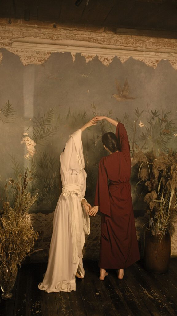
Warm colors include red, orange, and yellow. They are often associated with passion, energy and warmth. In fashion, they can spice up an outfit and attract attention. In the interior, they create a cozy atmosphere.
Cold colors
Blue, green and violet are among the cold colors. They are often associated with calm, relaxation and coolness. In fashion, they can soothe an outfit and provide a relaxed look. In the interior, they create a harmonious and relaxed atmosphere.
Neutral Colors
Black, white, gray and brown are neutral colors. They are often used as the basis for color combinations in fashion and interior design. They can create a classic and elegant atmosphere.
3. Color Combinations
Color combinations are crucial to the overall look of an outfit or room. Here are some popular color combinations:
Monochromatic color combinations
Monochromatic color combinations use one color in different shades. This combination creates a harmonious and elegant overall picture.
Complementary colour combinations
Complementary color combinations are created by combining colors that are opposite each other on the color wheel. For example, red and green or blue and orange. These combinations create a vibrant and energetic overall picture.
Triadic Color Combinations
Triadic color combinations consist of three colors that are equidistant from each other on the color wheel. For example, red, blue and yellow. These combinations create a lively and balanced overall picture.
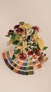
Helpful tools for color design
To find out if the colors match each other, or which colors can be combined well with the chosen shade, there are various tools. Analogously, this would be, for example, a special color wheel. But nowadays, there are also great tools online that you can use for free.
One of them, for example, is on page https://qconv.com/. There you can see a very detailed color portrait for every conceivable color code or special manufacturer colors. You can also convert color codes to other color systems. For example, if you bought your new wall paint from a well-known manufacturer and don’t know exactly which color would fit the curtains, you can look for the wall color there and get inspired.
Another possibility would be that you already have a hex code for a color, because I may have created a color palette from an image with a color tool and you are now wondering how to transfer this palette into colors for your interior? qconv can also help with this, because you can convert a hex code into colors from well-known manufacturers. Qconv will then suggest the colors that are closest to the shade.
4. Colors in fashion
In fashion, colors can spice up or soothe the outfit. Here are some of my tips for using colors in fashion:
- Warm colours such as red or orange to create an eye-catcher.
- Cold colors such as blue or green to create a calm look.
- Neutral colours such as black, grey but also navy and beige to create a classic and elegant look.
- Combination of different colors to create a vibrant and interesting outfit. However, make sure that the colors match each other harmoniously. Less is often more. I rarely combine more than a maximum of 3 different colors with each other and think that’s a good balance.
5. Colours in interior design
In interior design, colors can create an interesting atmosphere and visually increase or decrease the room. Here are some of my tips for using colors in interior design:
- Warm colours such as red or orange are suitable to create a cozy, but also stimulating atmosphere.
- Cold colors, such as blue or green, can create a relaxed atmosphere.
- Neutral colors, such as white or gray, can visually enlarge a room, but also appear rather cold, depending on the undertone.
- Brown and beige tones can have a calming effect. Since they are not distracting, they are very suitable for workspaces, for example, if you want to concentrate and prefer a quiet atmosphere.
- Combination of different colors to create a harmonious and interesting atmosphere. However, make sure that the colors match each other. Again, less is more. When designing a room, it helps to divide the colors into main and accent colors. A possible combination would be, for example: One main color, 1-2 gradations of the main color; 2 contrasting colors and 1-2 gradations of contrasting color. You can also use the help of a color wheel. By the way, this example would be a combination of triadic and monochromatic colors.
Conclusion
Colors are an important part of our world. In fashion and interior design, they can create a special atmosphere and influence the overall look. With this overview of colors and their meanings, you can now use colors in your outfit or room and create an atmosphere that suits you. What are your favorite colors? Which colors do you not find beautiful at the moment? How much effort do you put into choosing colors for your wardrobe or home? Feel free to let me know in the comments.
I wish you a creatoves weekend!
All the love
Christina
“Life is like a play. It’s not how long it is, it’s how colorful.”
Lucius Annaeus Seneca
Share this post:
We’re excited
to share our news with you!
Would you like to receive information about our latest articles and our latest products directly in your mailbox?
Sign up for our newsletter!
We’d love to keep you in the loop.
About the author
Christina Ernst is founder and CEO of Linen & Quince. She is also a designer, author and real estate expert. She shares her experiences and knowledge not only on our Linen & Quince blog, but also on her personal blog, christinaernst.net , where she writes about financial knowledge, starting a business, real estate knowledge and personal development. She loves interior design, art, antiques, as well as elegant, sustainable and high-quality fashion.